Style & Theming
Formitiva uses CSS variables as the single source of truth for styling.
All visual aspects—colors, spacing, typography, borders, and component states—are controlled through a consistent set of --formitiva-* variables.
Built-in themes are simply CSS files that define these variables. Formitiva components read from them at runtime, which makes theming predictable, flexible, and easy to override.
For the complete and authoritative list of variables, see the API reference: CSS Variables Reference.
How Formitiva Styling Works
CSS Variables as the Styling Engine
Formitiva components do not hardcode colors or spacing. Instead, they rely entirely on CSS variables such as:
--formitiva-primary-bg
--formitiva-text-color
--formitiva-border-focus
This design enables:
-
Theme switching without re-rendering components
-
Partial overrides without redefining entire themes
-
Safe coexistence of multiple themes on the same page
Theme Scoping
Each Formitiva instance renders a container with a data-formitiva-theme attribute:
<div data-formitiva-theme="material" class="formitiva-container">
  <!-- form content -->
</div>
Theme stylesheets target this attribute and define variables within its scope:
[data-formitiva-theme="material"] {
  --formitiva-primary-bg: #ffffff;
  --formitiva-text-color: #1f2937;
}
Because variables are scoped:
- Different forms can use different themes
- Themes can be swapped at runtime
- Overrides affect only the intended form instance
Major CSS Variables (Overview)
Formitiva themes all share the same variable names. Most customization only requires changing a small subset.
Colors & Surfaces
| Variable | Purpose |
|---|---|
--formitiva-primary-bg | Form/container background |
--formitiva-secondary-bg | Section/card background |
--formitiva-input-bg | Input background |
--formitiva-text-color | Primary text |
--formitiva-text-muted | Help text, hints |
--formitiva-border-color | Default border |
--formitiva-border-hover | Hover state |
--formitiva-border-focus | Focus ring |
--formitiva-error-color | Error states |
--formitiva-success-color | Success states |
Spacing & Layout
| Variable | Purpose |
|---|---|
--formitiva-container-padding | Form padding |
--formitiva-field-gap | Vertical spacing between fields |
Typography
| Variable | Purpose |
|---|---|
--formitiva-font-family | Form base font family |
--formitiva-font-size | Form base font size |
--formitiva-font-weight | Form base weight |
Shape & Controls
| Variable | Purpose |
|---|---|
--formitiva-form-border-radius | Form border radius |
--formitiva-form-border-style | Form border style |
--formitiva-form-border-width | Form border width |
--formitiva-border-radius | Control rounding |
--formitiva-border-width | Border thickness |
➡️ For the full list, see CSS Variables Reference
Quick Start (Using a Built-in Theme)
import '@formitiva/react/themes/material.css';
import { Formitiva } from '@formitiva/react';

function App() {
  return <Formitiva theme="material" definitionData={definition} />;
}
Examples: Customizing Themes
Example 1: Override a Few Variables (Recommended)
/* custom-theme.css */
[data-formitiva-theme="material"] {
  --formitiva-primary-bg: #f0f9ff;
  --formitiva-border-focus: #0284c7;
  --formitiva-button-bg: #0284c7;
}
import '@formitiva/react/themes/material.css';
import './custom-theme.css';
This approach keeps updates safe while allowing branding tweaks.
Example 2: Create a Custom Theme
[data-formitiva-theme="my-brand"] {
  --formitiva-primary-bg: #ffffff;
  --formitiva-secondary-bg: #f8fafc;
  --formitiva-text-color: #1e293b;
  --formitiva-border-focus: #3b82f6;

  --formitiva-space: 0.5rem;
  --formitiva-font-family: 'Inter', system-ui, sans-serif;
  --formitiva-border-radius: 0.5rem;
}
import './themes/my-brand.css';

<Formitiva theme="my-brand" definitionData={definition} />
Example 3: Combine Color Theme + Size Variant
import '@formitiva/react/themes/material.css';
import '@formitiva/react/themes/compact-variant.css';

<Formitiva theme="material" definitionData={definition} />
Built-in CSS Themes
Formitiva ships with 20 ready-to-use CSS themes, plus size variants.
Light Themes
- material
- ant-design
- blueprint
- fluent
- shadcn
- tailwind
- modern-light
- macos-native
- ios-mobile
- soft-pastel
- glass-morphism
- high-contrast-accessible
Dark Themes
- material-dark
- ant-design-dark
- blueprint-dark
- tailwind-dark
- midnight-dark
- neon-cyber-dark
Size Variants
- compact-variant
- spacious-variant
Size variants only adjust spacing variables and can be combined with any color theme.
Theme Naming Convention (Dark Mode)
Formitiva uses a naming convention to determine whether a theme is treated as a dark theme.
If a theme name contains the word dark, Formitiva automatically considers it a dark theme and adjusts component behavior accordingly (for example, contrast handling and internal defaults). This naming convention is to speed up dark mode check without checking primitive background color.
import { isDarkTheme } from '@formitiva/react';

isDarkTheme('material-dark');   // true
isDarkTheme('midnight-dark');   // true
isDarkTheme('material');        // false
Rules:
- Theme names must include dark if they represent a dark mode design
- Any theme name containing dark is treated as a dark theme
- Custom dark themes should follow this convention (e.g. my-brand-dark)
This rule ensures consistent dark-mode behavior across built-in and custom themes without requiring additional configuration.
Theme Builder
Formitiva provides a theme builder to simplify the process defining a custom theme.
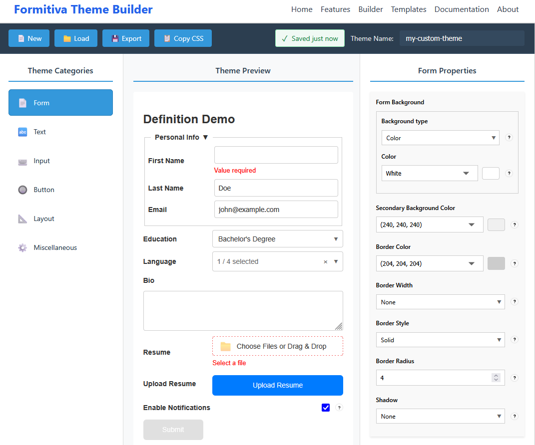
Visit Theme Builder to define your theme.
API Reference
For detailed, up-to-date documentation:
-
Complete CSS Variable List: 👉 CSS Variables Reference
-
Theme Utilities & Detection: 👉 Theme Utilities
-
Theme Catalog: 👉 Theme Catalog